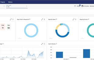
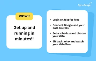
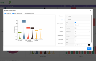
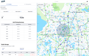
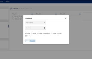
A powerful, intuitive data visualization tool. Create beautiful data-driven presentations & stories without writing code. Fully in-browser and completely free!.
- Free Personal • Proprietary
- Mac
- Windows
- Linux
- Online
- Chrome OS

A powerful, intuitive data visualization tool. Create beautiful data-driven presentations & stories without writing code. Fully in-browser and completely free!.

A managed Apache Hadoop, Spark, R, HBase, and Storm cloud service made easy.
Verfacto is a machine-learning tool for e-commerce businesses that unifies customer data and turns it into marketing insights.

Duck-UI is a web-based interface for interacting with DuckDB, a high-performance analytical database system. This project leverages DuckDB's WebAssembly (WASM) capabilities to provide a seamless and efficient user experience directly in the browser.

Award-winning financial reporting and analytics app. Go from data to decisions in seconds. Used by over 50,000 accountants, bookkeepers and businesses.

Light weight open source reports tool, that allows users to create their own HTML reports and dashboards just dragging and dropping elements, powered by a semantic layer.

SQL Server Compact Edition Database Query Analyzer.

Powerdrill AI is an AI SaaS service centered around personal and enterprise datasets—swift insights from your knowledge and data.

A complete set of tools that contains everything you need for oracle application development and administration. Features SQL Editor, HTML Documentation Generator, Reverse DDL Engineer, DB compare, ER Diagrammer and PL/SQL Debugger.

The company delves into the product sector with Visualr— a data visualization tool with simple drag and drop functionality, coupled with enhanced custom features. The product helps in exploring business insights by converting data into Information.
Design VS Design enables designers to easily compare and evaluate visual ideas with their audiences without lengthy user testing sessions.

Gadfly is a system for plotting and visualization written in Julia. It is based largely on Hadley Wickhams's ggplot2 for R and Leland Wilkinson's book The Grammar of Graphics. It was Daniel C. Jones' brainchild and is now maintained by the community.
Mercury allows you to add interactive widgets in Python notebooks, so you can share notebooks as web applications. Forget about rewriting notebooks to web frameworks just to share your results. Mercury offers a set of widgets with simple re-execution of cells.

EZlytix is a cloud-based Analytics in a box product. Our solution is designed for Mid-Market Manufacturing, Distribution, Retail organizations and small-mid size law firms.
Massif Visualizer is a tool that - who'd guess that - visualizes massif data. You run your application in Valgrind with --tool=massif and then open the generated massif.out.%pid in the visualizer. Gzip or Bzip2 compressed massif files can also be opened transparently.

Engage is a PowerPoint add-in that lets people of any skill level create and automate visually impressive presentations with infographics, pictograms and data maps.

Cloud-Infra-Visualization is an open-source tool designed to programmatically create infrastructure designs, diagrams and technical overviews for Microsoft Azure.

Arcade Analytics is the easy-to-use graph visualization tool that lets you quickly transform your data into vibrant and engaging visual formats.

Evernox is a browser-based tool for visually designing and managing relational databases with powerful features like real-time collaboration, AI-assisted SQL queries, and code generation in multiple languages and ORMs.

See your database in a new way. SeeQL is an easy-to-use desktop application that helps you visualize your database tables (including all foreign and primary key relationships), to quickly generate complex queries.

Unlock a world of knowledge and exploration with "World Population Data," the Android application for visualizing country data from diverse datasets. Dive into a wealth of information, from population trends to energy consumption, agriculture to trade dynamics, and...

One main focus is customizability without making the configuration too complicated. While Palamoa expects data in JSON format, its content is fully configurable. Any sensor device that can send JSON data can easily get connected.

A no-code desktop app for exploring, analyzing, and visualizing data locally — with support for big data, multiple formats, AI assistance, and interactive charts — all with privacy-first design.

DNIF provides a high value solution by combining technologies such as the SIEM, UEBA and SOAR into one product at an extremely low total cost of ownership.

Alpine Data Labs ushers in a new era for predictive analytics. It’s easy and fast, and brings contributors across the organization together to develop better insights.