

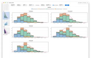
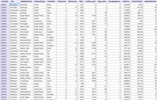
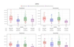
Native statistics app for Mac and Windows, menu-driven with 30+ chart types, robust ANOVA, regression, SPC charts, PCA, and machine learning. No scripting required.
Cost / License
- Paid
- Proprietary
Application type
Platforms
- Mac
- Windows



+4
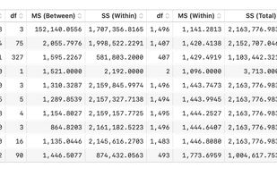


Native statistics app for Mac and Windows, menu-driven with 30+ chart types, robust ANOVA, regression, SPC charts, PCA, and machine learning. No scripting required.

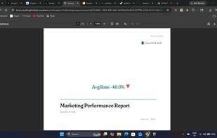
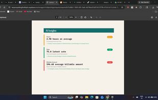
Turn CSV files and Google Sheets into branded, client-ready PDF reports with AI insights, charts, and anomaly detection in under 30 seconds.
 India
India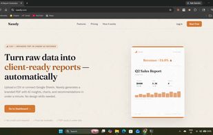


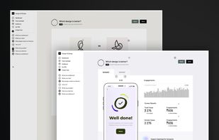
Design VS Design enables designers to easily compare and evaluate visual ideas with their audiences without lengthy user testing sessions.



Gadfly is a system for plotting and visualization written in Julia. It is based largely on Hadley Wickhams's ggplot2 for R and Leland Wilkinson's book The Grammar of Graphics. It was Daniel C. Jones' brainchild and is now maintained by the community.


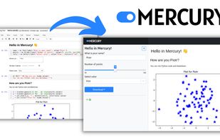
Mercury allows you to add interactive widgets in Python notebooks, so you can share notebooks as web applications. Forget about rewriting notebooks to web frameworks just to share your results. Mercury offers a set of widgets with simple re-execution of cells.


EZlytix is a cloud-based Analytics in a box product. Our solution is designed for Mid-Market Manufacturing, Distribution, Retail organizations and small-mid size law firms.


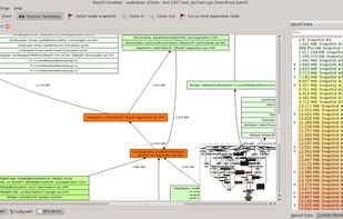
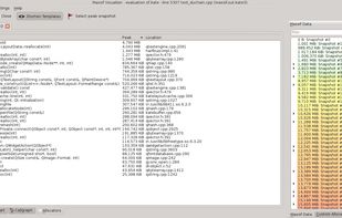
Massif Visualizer is a tool that - who'd guess that - visualizes massif data. You run your application in Valgrind with --tool=massif and then open the generated massif.out.%pid in the visualizer. Gzip or Bzip2 compressed massif files can also be opened transparently.
 Germany
 EU
EU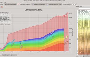
 KCacheGrindandWebgrind
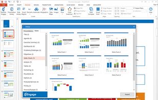
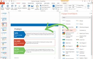
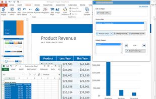
Engage is a PowerPoint add-in that lets people of any skill level create and automate visually impressive presentations with infographics, pictograms and data maps.
 United States
 LibreOffice - Impress
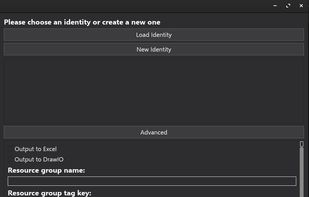
Cloud-Infra-Visualization is an open-source tool designed to programmatically create infrastructure designs, diagrams and technical overviews for Microsoft Azure.

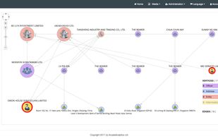
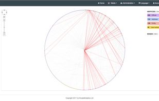
Arcade Analytics is the easy-to-use graph visualization tool that lets you quickly transform your data into vibrant and engaging visual formats.
 ItalyEU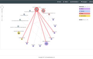


Evernox is a browser-based tool for visually designing and managing relational databases with powerful features like real-time collaboration, AI-assisted SQL queries, and code generation in multiple languages and ORMs.
 AustriaEU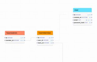
 draw.ioand
 DBeaverand
 phpMyAdmin
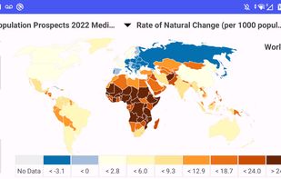
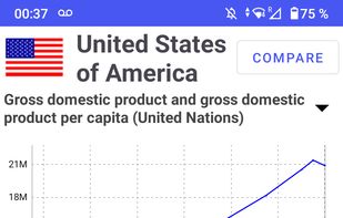
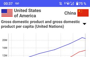
Unlock a world of knowledge and exploration with "World Population Data," the Android application for visualizing country data from diverse datasets. Dive into a wealth of information, from population trends to energy consumption, agriculture to trade dynamics, and...


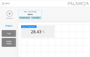
One main focus is customizability without making the configuration too complicated. While Palamoa expects data in JSON format, its content is fully configurable. Any sensor device that can send JSON data can easily get connected.



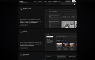
Generative UI layer for chatbots. It's an API layer on top of LLMs that builds adaptive UIs in real time. It turns responses from your model into live interfaces using a React SDK.
United States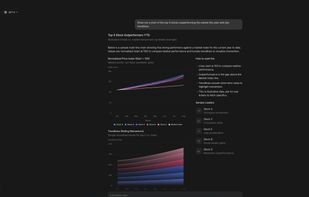

A no-code desktop app for exploring, analyzing, and visualizing data locally — with support for big data, multiple formats, AI assistance, and interactive charts — all with privacy-first design.
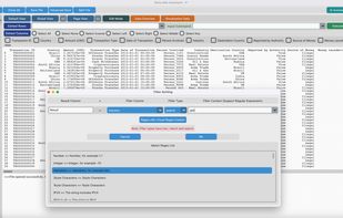
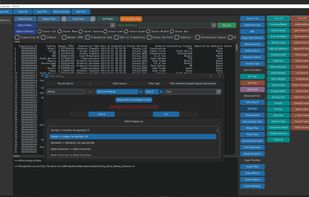

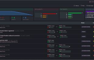
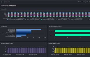
DNIF provides a high value solution by combining technologies such as the SIEM, UEBA and SOAR into one product at an extremely low total cost of ownership.
India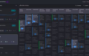
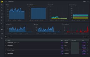

Alpine Data Labs ushers in a new era for predictive analytics. It’s easy and fast, and brings contributors across the organization together to develop better insights.

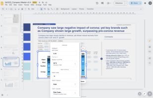
Build consultant-grade charts — waterfalls, stacked bars, variance bridges — natively inside Google Slides, Docs and Sheets. A think-cell alternative for teams on Google Workspace.
 DenmarkEU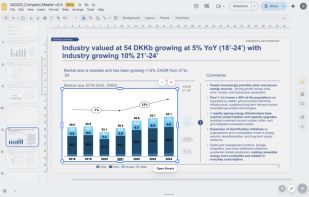


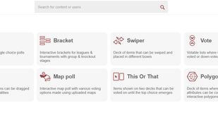
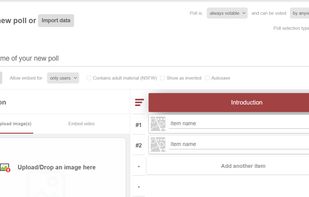
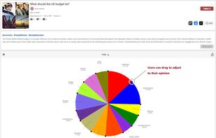
Ranx is an online social platform for crowdsourcing and aggregating opinion with AI and user generated snap survey tools like polls, votes, rankings, ratings, brackets, comparisons, debates and many more interactive formats.


ZENPLOT® allows you to create impactful visualizations by stacking different graphic layers (histograms, scatterplots, line charts, bar charts etc.). The data can be linked to any characteristic of the different layers (color, shapes, etc.).
 FranceEU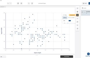
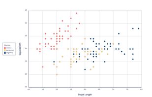
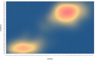
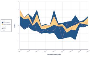

SciChart provides GPU-accelerated chart libraries for demanding business, scientific, medical & financial applications on multiple platforms including JavaScript, iOS, Android, macOS and Windows Presentation Foundation.
 United Kingdom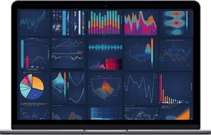

manubes is an innovative cloud platform for digital production management, tailored to the needs of industrial manufacturers. With manubes you are able to effectively structure, visualize and manage your production from anywhere in the world while benefitting from a secure and...
GermanyEU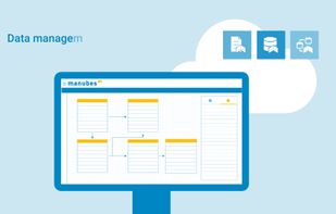


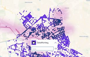
Get unique, filtered, reliable geo data sets via natural language. "All power plants in Illinois"? "Schools in San Francisco"? "Bike lanes in Amsterdam"? Type in what you search for & get the corresponding data set in seconds.
United States