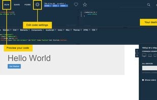
Gridless is an optionated HTML5 and CSS3 boilerplate for making mobile first responsive, cross-browser websites with beautiful typography.
- Free • Open Source
- Online
Best alternatives are  Bootstrapand
 Tailwind CSS
52 alternativesBootstrapandTailwind CSS