



AlternativeTo September Recap: New badges, hide apps by tag, revamped lists and more
Hey guys! Over the last few weeks we’ve been adding a bunch of new features and improvements to AlternativeTo, so we thought it was time for a quick monthly recap. You may have already stumbled across some of these, but in case you haven’t, here are some of the main things we’ve been working on lately:
New stuff on app pages
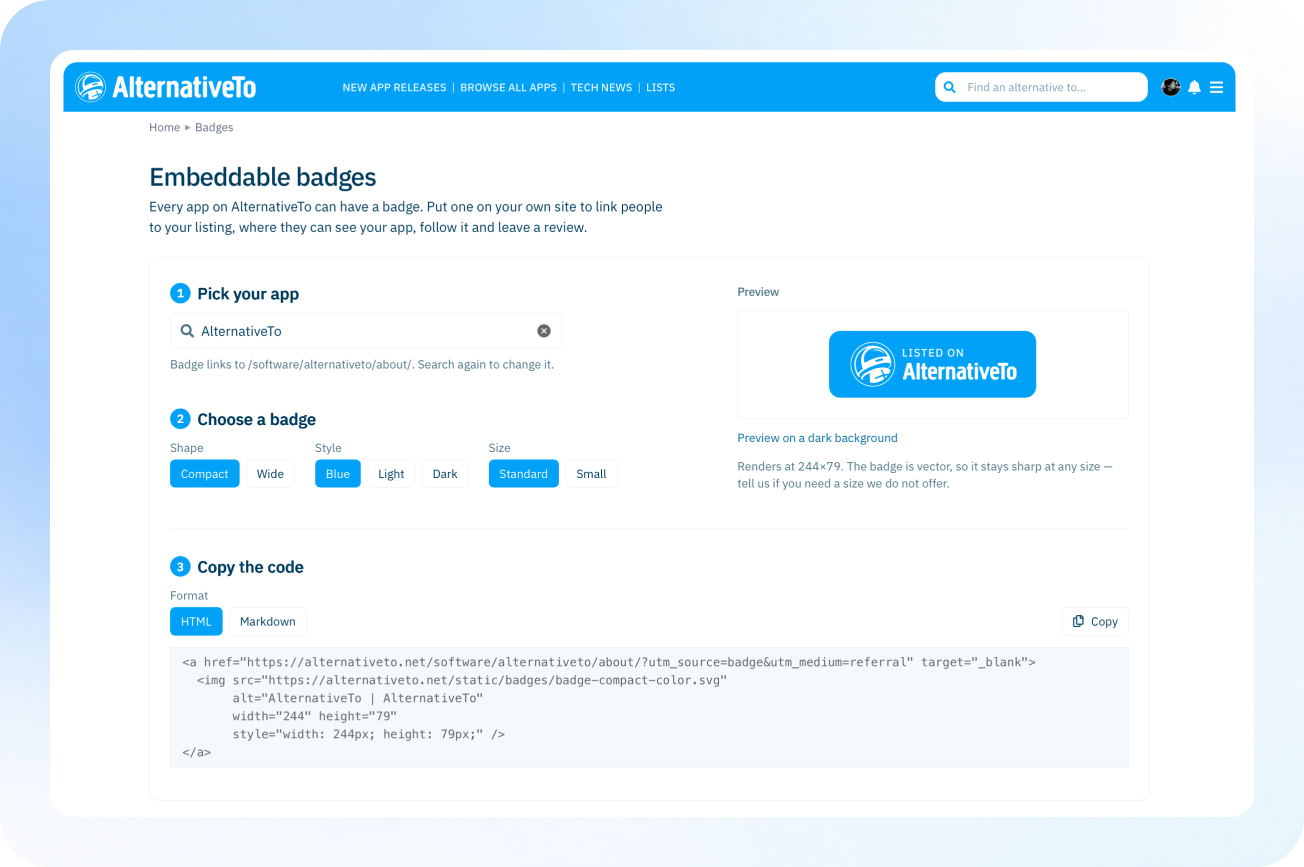
We’ve added a new collection of embeddable AlternativeTo badges for app makers. The new badge builder lets you pick from several designs and add them to your own website, with each badge linking back to your AlternativeTo listing. App pages also support more social links, including Mastodon, Bluesky, Threads, Discord, Reddit, Instagram, YouTube, TikTok and LinkedIn. If there’s another platform you’d like us to support, let us know! We’ve also moved Official Links higher up in the sidebar for easier access, and you can also access important links from the sticky bar as you scroll down.
More control over what appears in your lists

We’ve added one of the features many of you have been asking for: the ability to hide apps from lists based on their tags. For example, you can now hide AI-powered or discontinued apps while browsing alternatives, categories and other app lists. And it isn’t limited to those two options: the same filtering system can work with any tag. This also means the tags you help us maintain matter even more. If you spot an app that’s missing a relevant tag, you can suggest it through Submit a change.
Signed-in users will also be able to save their preferred filters as defaults, including tags, platforms, licenses, origins and even specific countries. Set them once and they’ll automatically apply across lists, so you can browse AlternativeTo the way you want without having to set them again on every list. 🙂
Lists and saving apps
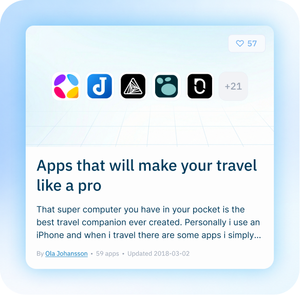
There’s now a one-click Save button on app pages and cards, letting you quickly save something for later or add it directly to one of your own lists (next to the like button).
Not only that, but Lists itself have also received a refresh with new full-width covers, collapsible sections, clearer owner notes and automatically generated cover images using their app icons. Sharing a list now generates its own social preview too, including its apps, title and author (much nicer imho 🙂).
Community and messaging improvements
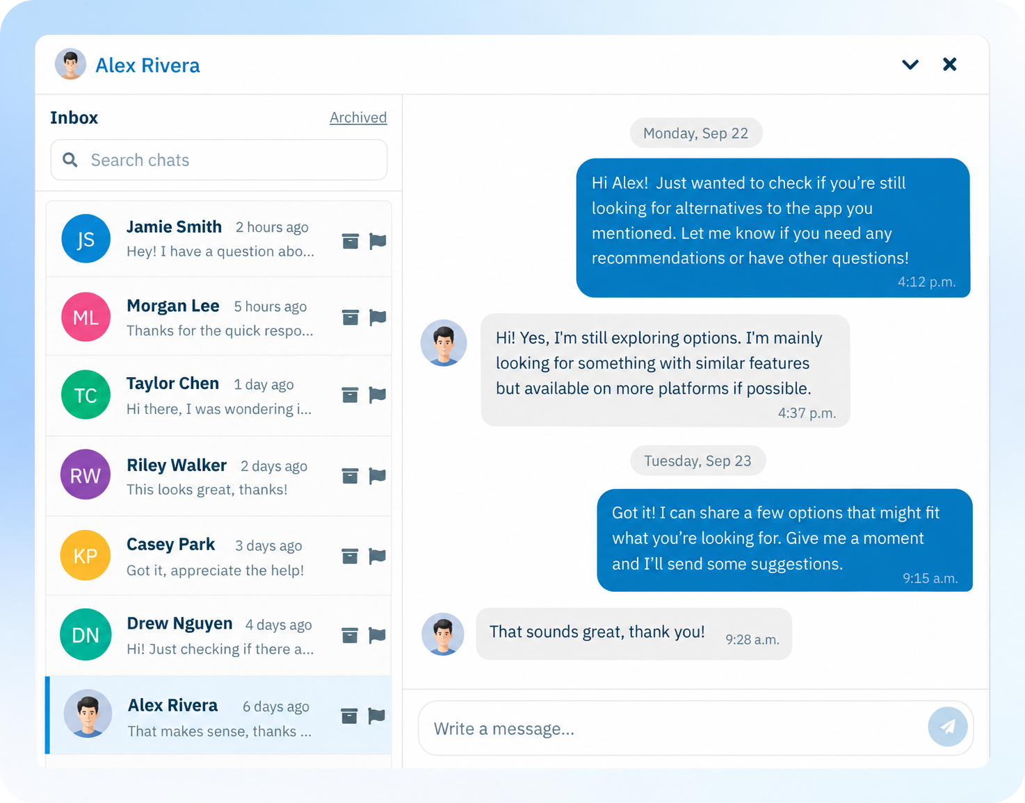
Private messages have been rebuilt to feel more like a proper inbox, with a larger conversation view, unread markers, search and saved drafts. We’ve also made a number of smaller community improvements, like direct replies to individual replies (with their own notification), brought the community feed to the start page, made your rank and progress easier to follow, and added suggestions for other apps after you cast an alternative vote.
And a few more, before this gets way too freaking long:
- You can now follow users and start your own little cult of followers who can keep up with your latest activity.
- News now has a keyword-based search to easily find articles, and related apps mentioned in them now appear in the sidebar.
- App pages have an updated counts bar and a new phone frame for portrait screenshots.
- Clear all filters is always visible, and filter chips now scroll in a single row on mobile.
- We’ve tuned the dark theme, improved forms on smaller screens and reduced layout shifts while pages load.
And that’s it for this month! We’re continuing to tweak and improve many of these features, and we hope you find some of them useful. As always, if you spot something that could work better or have an idea for AlternativeTo, let us know! Until next month 😉




Comments
great work, thank you all! ^_^
This is awesome, the little improvements from the login to the apps floating over the images for lists has not gone unnoticed. Love the improvements and cant wait to see more
I used to have to copy / paste the entire description of an app before adding my comments to an app when creating a list. Glad to see I can just tag a note to the default description now!
One definite feature I think is lacking is a flag on software telling us if the software is in beta as opposed to production-ready. I've gone through alternatives, sometimes finding something that looks right only to be disappointed that it is either in alpha or beta by checking their repo or website and therefore not appropriate for what I need. Having a flag like that would be super helpful!