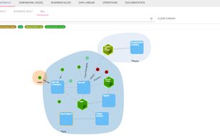
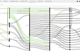
Tom Sawyer Software is the leader in graph visualization and analysis software. We help you gain new understanding from your data and enhance your applications.
Cost / License
- Paid
- Proprietary
Platforms
- Mac
- Windows
- Online


Tom Sawyer Software is the leader in graph visualization and analysis software. We help you gain new understanding from your data and enhance your applications.

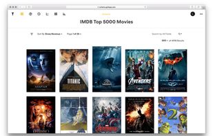
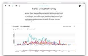
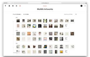
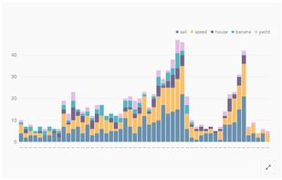
Use Gist to create simple, beautiful data applications that enable individuals and teams to explore datasets, extract knowledge, and share insights.
 United States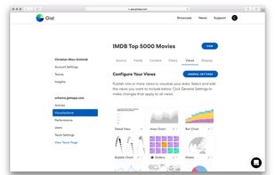

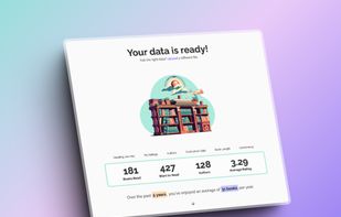
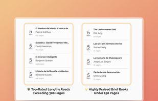
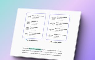
Readstats is a free, private and easy way of visualizing your reading journey through the years! Inspired by Spotify Wrap and born from my twin loves of reading and delightful data visuals.




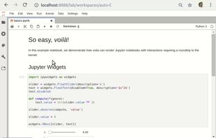
Voilà turns Jupyter notebooks into standalone web applications. Each user connecting to the Voilà tornado application gets a dedicated Jupyter kernel which can execute the callbacks to changes in Jupyter interactive widgets.


Tide is a beautifully designed, modern social media aggregator. Nothing is more important to us than great design, and the current tweet walls just didn't cut it - so we made our own. Whether projecting to delegates or embedding in your website we have a solution for you.


Cluvio is the #1 cloud BI platform for startups and data-driven teams, trusted by over 300 companies. Use SQL and R to analyze your data and in few minutes create beautiful, interactive dashboards for your entire company.
 Germany
 EU
EU
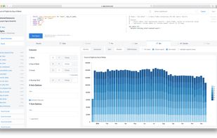

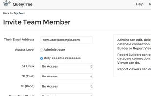
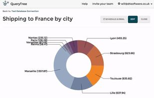
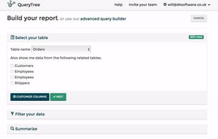
QueryTree is a flexible and powerful database reporting tool. Simply connect your database and start visualizing your data in minutes. Everything works with a dropdown menu interface - no code or SQL needed.
 United Kingdom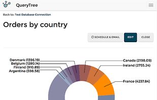


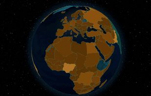
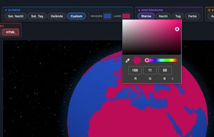
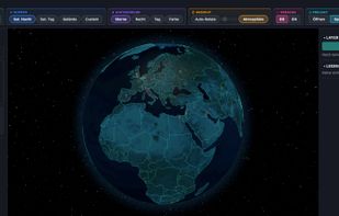
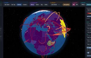
Turn any CSV into a rotating 3D globe. Choropleth maps, 3D columns, points & connection arcs — 244 countries, 19 palettes, 4 textures incl. NASA imagery. Export as PNG or standalone HTML. Fully offline, one-time purchase.
 Google Earthand

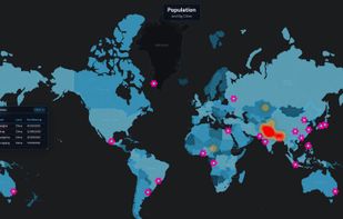
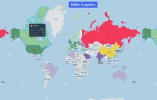
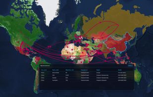
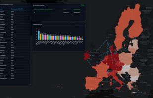
Turn CSV & Excel data into interactive map analytics dashboards — choropleth, bubbles, heatmaps, connection lines & more. 10 map styles, export to HTML/PDF/PPTX. Fully offline, no cloud, no subscription. One-time purchase.

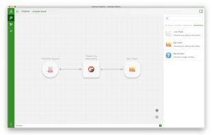
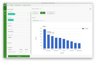
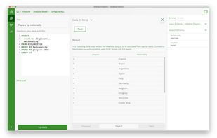
Ananas Analytics Desktop is a hackable data tool that helps your team combining non-technical and technical users to collaborate and build data analytics faster. Connect data from anywhere. Transform, analyze, and visualize to build analytics in minutes.


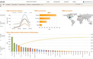
Enterprise-caliber BI delivers accurate, actionable content in an intuitive, self-service environment. It allows users to combine data from different source systems to get answers to their most pressing business concerns in real time.
United States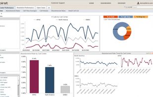
 Openpanel.devand

Create powerful dashboards from your company’s data and quickly discover insights with Chartio.
United States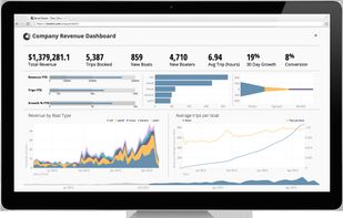
 Openpanel.dev
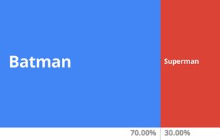
Data Gif Maker is an easy to use gif creation tool from Google News Lab that lets you make gifs for comparing data sets. As an example, you can create an animated gif illustrating the percentage of people who prefer one food item over another.
United States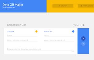
 DataGIF.io
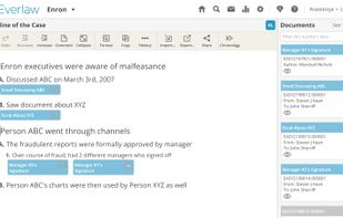
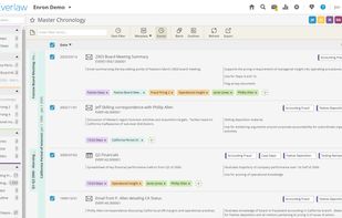
Everlaw is a technology company that applies intuitive design and engineering advances to challenges in the legal industry. Everlaw's litigation platform replaces antiquated tools to help major lawyers win in court.
United States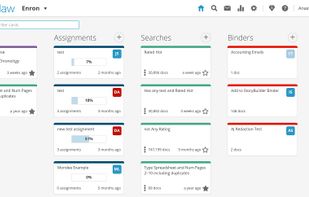


Cartoonify turns your photo into a cartoon drawing, powered by Draw This by Dan Macnish and the Google QuickDraw dataset. Upload any image below to try it out!.


GGobi is an open source visualization program for exploring high-dimensional data. It provides highly dynamic and interactive graphics such as tours, as well as familiar graphics such as the scatterplot, barchart and parallel coordinates plots.


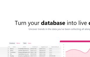
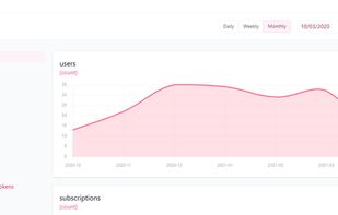
Uncover trends in the data you have been collecting all along. Automatically generate charts from your live database without writing code.

 Tianji
Formerly "periscope," Sisense for Data Teams is a cloud business intelligence tool with SQL, Python, and R support and visuals of the original Sisense platform.

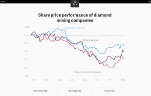
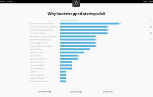
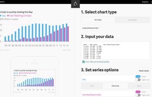
Atlas gives each chart its own home, along with a set of tools for interacting with them: You can download the data behind the charts, embed them elsewhere on the web, grab an image, and of course share them on social media.


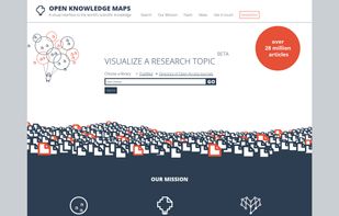
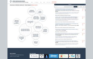
We are creating a visual interface to the world's scientific knowledge that can be used by anyone in order to dramatically improve the discoverability of research results


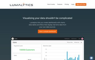
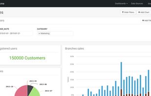
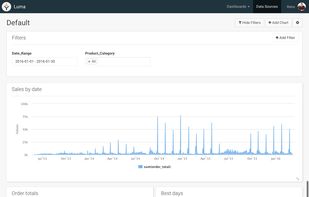
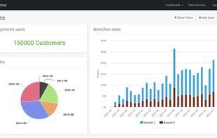
Lumalytics lets you create dashboards with charts, data tables and filters that display data from your own data sources (MySQL, Postgres, Redshift, SQL Server or CSV files).


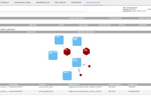
4th generation automation tool covering all aspects and phases of a DWH. Design & Development Lifecycle Management Operations Industry standards processes enable your agile Data Warehouse to delivery business value immediatelly.