Open-source editor for vector and interface designs with AI-powered creation, Figma file support, real-time peer-to-peer collaboration, code export, and advanced programmability.
 Russia
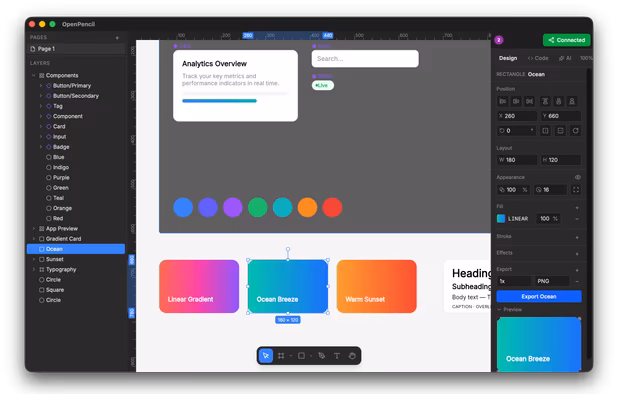
Open-source editor for vector and interface designs with AI-powered creation, Figma file support, real-time peer-to-peer collaboration, code export, and advanced programmability.
UI framework offering over 50 UI elements and 3000+ CSS variables. Integrates with React, Angular, and more, providing responsive design and easy theming.


 Bootstrapand


 Bootstrapand
Responsive framework with semantic, mobile-first design, offering HTML, CSS, JS resources for sites and emails, crafted by Zurb for accessibility.
Bootstrapand

 Bootstrapand
 Bootstrapand
Skeleton is a small collection of CSS & JS files that can help you rapidly develop sites that look beautiful at any size, be it a 17" laptop screen or an iPhone. Skeleton is built on three core principles:
Bootstrapand
Hexo is a fast, simple and powerful blog framework powered by Node.js which have extensive plugins selections for a Static Site Generator and a great communities.
Simple. Robust. Responsive. Flexible.
Based on Flexbox (CSS Flexible Box Layout Module), Gridlex is a very simple css grid system to quickly create modern layouts and submodules.
 Bootstrapand
Responsable is a responsive HTML CSS LESS SCSS framework with clean markup, normalized CSS, and responsive images. It allows for nested columns for easy grid nesting and customization, and provides base styles for forms, tables, and typography for faster startup on your projects.
BootstrapandBootstrapandBootstrapandA grid system for responsive web design. Includes folding columns, elastic gutters, a zoomable baseline grid, and a delightful grid overlay script.
Bootstrapand
Less Framework is a CSS grid system for designing adaptive websites. It contains 4 layouts and 3 sets of typography presets, all based on a single grid.
Bootstrapand
The 960 Grid System is an effort to streamline web development workflow by providing commonly used dimensions, based on a width of 960 pixels. There are two variants: 12 and 16 columns, which can be used separately or in tandem.
BootstrapandBootstrapand
AlloyUI is a framework built on top of YUI3 (JavaScript) that uses Bootstrap (HTML/CSS) to provide a simple API for building high scalable applications.
 Reactand
Milligram provides a minimal setup of styles for a fast and clean starting point. Specially designed for better performance and higher productivity with fewer properties to reset resulting in cleaner code.
BootstrapandThe Fluid 960 Grid System templates have been built upon the work of Nathan Smith and his 960 Grid System using effects from the MooTools and jQuery JavaScript libraries. The idea for building these templates was inspired by Andy Clarke, author of Transcending CSS, who advocates...
BootstrapandBootstrapandUnsemantic is a fluid grid system that is the successor to the 960 Grid System. It works in a similar way, but instead of being a set number of columns, it's entirely based on percentages.
Bootstrapand
ScribbleX is an online web development platform that allows user to code in HTML, CSS, and JavaScript and test the code in the real time. It also provides a dedicated sandbox link for every project which can be used to access the code or to share it with others.
 Australia
 France
 EU
EU
 United States
 Germany
 Canada
 Spain
Spain Finland
 Brazil