
Who Can Use
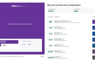
WhoCanUse is a tool that brings attention and understanding to how color contrast can affect different people with visual impairments.
Cost / License
- Free
- Open Source (MIT)
Platforms
- Online
Features
Who Can Use News & Activities
Recent activities
Who Can Use information
What is Who Can Use?
What is WhoCanUse?
It's a tool that brings attention and understanding to how color contrast can affect different people with visual impairments. The Web Content Accessibility Guidelines covers a wide range of recommendations for making Web content more accessible. Just a tiny part of making the web more accessible is accommodating for those with a form of blindness or low vision. The standard grading system is a great start, but I thought I'd try to humanize the people who are affected by the different grades.
Where did you get the info from?
The percentages are sourced from both colour-blindness.com and Vision Australia.
Your math is off, it doesn't add up to 100%?
Good eyes! The population data provided are estimates for individual impairments, and don't cover the vast amount of visual impairments in the world. This is to give you not just an understanding of how color contrast affects different people but also who it can affect.
I'm fascinated by how this works, can you tell me more?
Of course! There's a few stages to get to this point. First we figure out the contrast between two HEX values. For this we're using a plugin called Chrome.JS - this does the heavy lifting for us. Once we have the ratio (and using font size and font weight) we can apply a grade to that specific color combo.
For the color blindness options we're using another plugin aptly called Color-blind that converts our HEX codes into ones that would be seen by people with the different impairments, then we can apply our same process to obtain the color ratios and determine their grade. For cataracts, glaucoma, low vision, and the situational events I've personally created simulations to help identify their rating.
What does a failing grade mean?
The grading uses a combination of color contrast, text size and text weight. A fail simply means that the color combination offers some visual strain to the person seeing it and should be avoided if possible.


