The Goldilocks Approach Alternatives

The Goldilocks Approach is described as 'To Responsive Web Design - A good starting point for design that takes device resolution out of the equation' and is an website in the development category. There are more than 50 alternatives to The Goldilocks Approach, not only websites but also apps for a variety of platforms, including Self-Hosted, Mac, Windows and Linux apps. The best The Goldilocks Approach alternative is Bootstrap, which is both free and Open Source. Other great sites and apps similar to The Goldilocks Approach are Tailwind CSS, Foundation, Materialize and Material UI.

Copy a direct link to this comment to your clipboard
The Goldilocks Approach alternatives page was last updated

Alternatives list

  1. Copy a direct link to this comment to your clipboard

    The Fluid Baseline Grid System is an HTML5 & CSS3 development kit that provides a solid foundation to quickly design websites with ease.

    Cost / License

    • Free
    • Open Source

    Platforms

    • Online
     
  2.  1 like
    Copy a direct link to this comment to your clipboard

    Gridless is an optionated HTML5 and CSS3 boilerplate for making mobile first responsive, cross-browser websites with beautiful typography.

    Cost / License

    • Free
    • Open Source

    Platforms

    • Online
     
  3. Copy a direct link to this comment to your clipboard

    Dig responsive design? Hate fluid grids? Try a Frameless grid.

    53 Frameless Grid alternatives

    Cost / License

    • Free
    • Open Source

    Platforms

    • Online
     
  4. Copy a direct link to this comment to your clipboard

    The Fluid 960 Grid System templates have been built upon the work of Nathan Smith and his 960 Grid System using effects from the MooTools and jQuery JavaScript libraries. The idea for building these templates was inspired by Andy Clarke, author of Transcending CSS, who advocates...

    Cost / License

    • Free
    • Open Source

    Application type

    Platforms

    • Mac
    • Windows
    • Linux
    • Online
    • BSD
     
  5.  1 like
    Copy a direct link to this comment to your clipboard

    Foldy960 - A responsive version of the 960 grid, the Pvel way!.

    Cost / License

    • Free
    • Open Source

    Application type

    Platforms

    • Mac
    • Windows
    • Linux
    • Online
    • BSD
     
  6. Copy a direct link to this comment to your clipboard

    Unsemantic is a fluid grid system that is the successor to the 960 Grid System. It works in a similar way, but instead of being a set number of columns, it's entirely based on percentages.

    Cost / License

    • Free
    • Open Source

    Application type

    Platforms

    • Mac
    • Windows
    • Linux
    • Online
    • BSD
     
  7. Copy a direct link to this comment to your clipboard

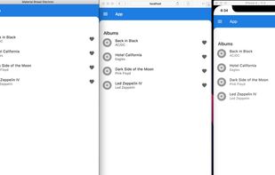
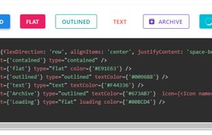
    Material Bread is a Material component library for React and React Native covering mobile, desktop platforms and the web. Featuring full documentation with storybook for easy code samples and a robust set of...
    Cost / License

    • Free
    • Open Source

    Platforms

    • Self-Hosted
     
  8. Copy a direct link to this comment to your clipboard

    MWF is a system that allows site authors to consider how best to tell the story of Microsoft products and services with confidence that the modular pieces will support and work together.

    Cost / License

    • Free
    • Open Source

    Platforms

    • Self-Hosted
     
  9. Copy a direct link to this comment to your clipboard

    A 1140px wide, 12 column grid. Fluid all the way down to a mobile version.

    Cost / License

    • Free
    • Open Source

    Platforms

    • Online
     
  10. Copy a direct link to this comment to your clipboard

    This is the Responsive Grid System, a quick, easy and flexible way to create a responsive web site.

    Cost / License

    • Free
    • Open Source

    Platforms

    • Online
     
  11. Simple Grid icon
     1 like
    Copy a direct link to this comment to your clipboard

    A simple, lightweight, responsive, 12-column grid and container system for your website.

    Cost / License

    • Free
    • Open Source

    Platforms

    • Online
    • Self-Hosted
     
  12. PrettyCSS icon
     1 like
    Copy a direct link to this comment to your clipboard

    Build your website interface using a responsive CSS framework with various components and with integrated dynamic functionalities.

    Free for non-commercial purposes.

    100 PrettyCSS alternatives

    Cost / License

    • Subscription
    • Proprietary

    Application type

    Platforms

    • Online
    • Self-Hosted
    • CSS
    • HTML5 Boilerplate
    • JavaScript
     
You are at page 4 of The Goldilocks Approach alternatives