


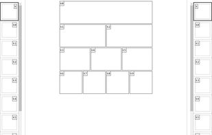
This is the Responsive Grid System, a quick, easy and flexible way to create a responsive web site.
Cost / License
- Free
- Open Source
Platforms
- Online


Apps similar to Bootstrap include Tailwind CSS, which is free and open source. Other options are Bulma, Semantic UI, Material UI and Foundation. CSS Frameworks like Bootstrap are a crowded field, with more than 100 alternatives for the web, self-hosting, Mac, Windows and Linux.
This is the Responsive Grid System, a quick, easy and flexible way to create a responsive web site.

The 960 Grid System is an effort to streamline web development workflow by providing commonly used dimensions, based on a width of 960 pixels. There are two variants: 12 and 16 columns, which can be used separately or in tandem.


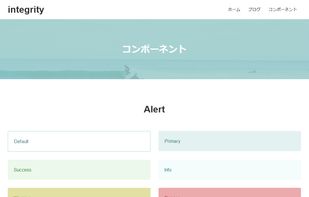

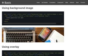


The Goldilocks Approach to Responsive Web Design - A good starting point for design that takes device resolution out of the equation.


yeti.css is a pattern library consisting of lightweight, reusable modules. It has been built to reflect &yet's visual and branding guidelines.
 United States
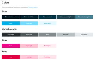
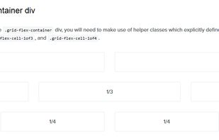


Build your website interface using a responsive CSS framework with various components and with integrated dynamic functionalities.
Free for non-commercial purposes.
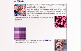
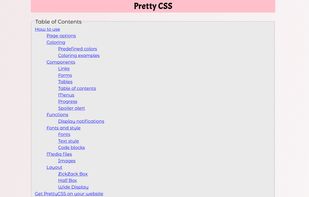
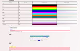


Bacuri is a minimalist framework that uses Material Design concepts, and has a plugin system to enhance its capabilities.


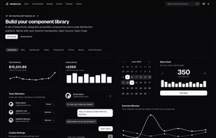
A set of beautifully-designed, accessible components and a code distribution platform. Works with your favorite frameworks. Open source. Open code.


A product/service hybrid to create sustainable, repeatable, business value. Using winning-formula design via your customer's mobile – InstantWebapp aims to ramp up digital delivery, improve customer confidence & create high-quality, low-regret deals.




 Brazil


