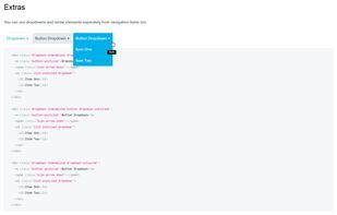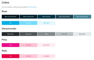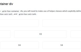


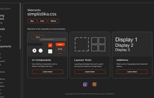
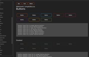
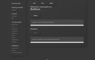
Webments is a collection of libre frameworks designed with scratch CSS using different design languages.



+1




Apps similar to Bootstrap include Tailwind CSS, which is free and open source. Other options are Semantic UI, Bulma, Material UI and Foundation. CSS Frameworks like Bootstrap are a crowded field, with more than 100 alternatives for the web, self-hosting, Mac, Windows and Linux.
Webments is a collection of libre frameworks designed with scratch CSS using different design languages.

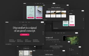
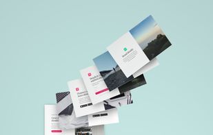
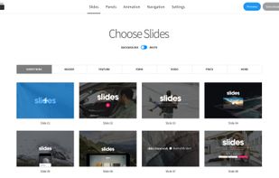
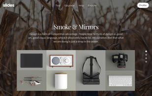
Slides is a simple and powerful HTML and CSS framework that lets you easily build beautiful static websites thanks to a flexible modular setup.
 Ukraine


Responsable is a responsive HTML CSS LESS SCSS framework with clean markup, normalized CSS, and responsive images. It allows for nested columns for easy grid nesting and customization, and provides base styles for forms, tables, and typography for faster startup on your projects.


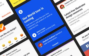
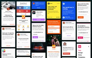
Little Widgets is a collection of beautifully designed HTML website widgets and popups. It’s coded, responsive, animated and ready to use on your website.



Lite CSS is a simple but also unique web framework. The term 'Lite' expresses the simplicity but also how light the project is!


This is the Responsive Grid System, a quick, easy and flexible way to create a responsive web site.


The 960 Grid System is an effort to streamline web development workflow by providing commonly used dimensions, based on a width of 960 pixels. There are two variants: 12 and 16 columns, which can be used separately or in tandem.


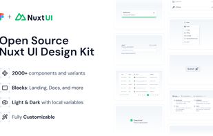
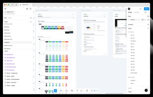
Create beautiful, responsive & accessible web apps quickly with Vue or Nuxt. Nuxt UI is an open-source UI library of 100+ customizable components built with Tailwind CSS and Reka UI.




The Goldilocks Approach to Responsive Web Design - A good starting point for design that takes device resolution out of the equation.


yeti.css is a pattern library consisting of lightweight, reusable modules. It has been built to reflect &yet's visual and branding guidelines.
 United States