Microsoft is launching a big redesign for the Windows 11 start menu with categories view
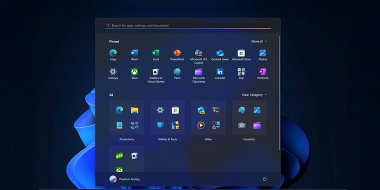
Microsoft is rolling out a major Start menu redesign for Windows 11, now available in the latest Dev and Beta Channel preview builds. The new design replaces the two-section layout with a single scrollable view, where pinned apps and recommendations appear at the top and the 'All Apps' list sits directly below.
Users can now disable the "Recommended" section entirely, keeping only pinned apps and folders visible. The Start menu also introduces three layout options for viewing apps: a named list, a named grid, and categorized folders similar to iOS’s App Library, while also resembling some of the custom layouts available in Start11, a popular alternative for customizing the Windows Start menu.
The redesign allows all pinned apps to be shown at once without scrolling and provides a larger, more expansive menu compared to the current compact version. New settings options enable displaying all pins by default and showing browsing history websites within the Start menu.


Comments
After using Linux Desktop Environments on and off, it has spoilt me a little coz I do like how the apps are organised so this is a (slightly) welcome idea. It kinda gives the iPad category vibes, but I'd like to see more customisation (for example, to make lists, etc). And they better not stuff ads into it.
Woah, look how many ads could fit on that thing! Sweet!
Gave me a right chuckle. So true.
I've been using the program iTop Easy Desktop for this sort of thing (it puts the categories on desktop vs start area) Whether I'll make the change to Win 11 vs Linux is questionable.
I’ve mostly used Start11 for the Start menu, but this solution looks more like
  Fences and I think it works great for categories. I’ll check it out!
"Fun" fact: this W11 launch menu is written in React Native (like VS Code). It's another great Microsoft software design idea. So the complete waste of space everywhere in the menu is certainly because Windows devs are not good at CSS, nor at mobile interfaces.
Nah
Fun fact - VS Code is not written in React Native, neither is W11 launch menu.