
UI Playground
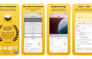
Play with native iOS user interface components on iPhone. The key? You’re working with real native UI — not abstractions. What you test is exactly what users experience.
Cost / License
- Pay once or Subscription
- Proprietary
Application types
Platforms
- iPhone
Features
Properties
- Lightweight
Features
- Design handoff
- No registration required
- Create UI Components
- No Tracking
- Dark Mode
- Ad-free
- Works Offline
- No Coding Required
- Graphical User Interface
- UI Design
UI Playground News & Activities
Recent activities
- emanuel-m-fernandes added UI Playground
 emanuel-m-fernandes added UI Playground as alternative to Sketch, Figma, InVision and Play Design
UI Playground information
What is UI Playground?
Craft a great user experience by choosing the appropriate interface components with the right customisation.
Explore and customise native UI components to unlock endless possibilities for your app. Take it to the next level, by previewing a live component within the context of your app, simply by adding a screenshot image. Finally, export native code to share with developers streamlining development.
FOR DESIGNERS Explore on the device, all the possibilities that each user interface component supports, exactly as it will work in a real app.
FOR DEVELOPERS Learn SwiftUI backwards by first interacting with components on iPhone and then reading or applying the code in a real app.
FOR PRODUCT OWNERS Convey your ideas faster by designing small interactions within the context of your app, without the commitment of implementation.
FEATURES • Auto-save: Automatically save every customisation you make — never loose your work. • Save Multiple Drafts: work on the same component with different customisations. • Human Interface Guidelines: small instructions lead to a proper usage of components that respect HIG. • Design & Developer Docs: get more information about each component on Apple's website. • Custom Semantic Colors: add your own colors with a version for light and dark mode. • Custom SF Symbols: add your own symbols for an extra level of precision. • Guides: align components within the safe areas or highlight the component. • Grouped Components: advanced components lets you build an entire Settings area. • Save to iCloud: work on multiple devices without loosing the work.


