
story.to.design
Like
Generate and sync a full Figma library from Storybook. Keep your Figma components up to date with code in a single click.
Cost / License
- Subscription
- Proprietary
Platforms
- Figma
- Online
Features
- Create UI Components
- Ad-free

- Graphical component
Figma Integration
- Figma plugin
story.to.design News & Activities
Highlights All activities
Recent activities
 POX added story.to.design as alternative to Foundation Studio
story.to.design information
No comments or reviews, maybe you want to be first?
What is story.to.design?
![]() Storybook to
Storybook to Figma.
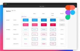
Generate and sync full Figma components from your code.
Connect your stories to Figma in 3 steps 100+ components to create in Figma? Thousands of variants to maintain? story.to.design does it for you.
- Connect your Storybook, Backlight or Histoire
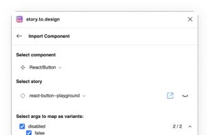
- Select components and variants
- Generate components in Figma
Keep Figma in sync with Storybook, no maintenance required. Want to update hundreds of variants with the latest changes? story.to.design brings all code updates from Storybook to Figma in a click.
- Quick updates: Get notified any time the code changes in Storybook and update your Figma designs in a click.
- Visual reviews: Review updates visually before bringing them from Storybook to Figma, for design and code that's always aligned.
Features our users love:
- Generate quality Figma layers with auto-layout: story.to.design generates high-fidelity Figma layers with auto-layout, whenever possible.
- Import nested components: story.to.design automatically detects and links nested-components for you. Your UI kit has never been so complete.
- Enhance Figma's Dev Mode: story.to.design provides code snippets for the components used in designs, complete with all properties and attributes to use in your app.
- Simulate states: Simulate your components' pseudo-states automatically: hover, tap, active and focus.
- Multi-brand support: story.to.design supports Storybook "globals" to select themes. Import multiple brands as different variants, components or in different Figma files.
- Responsive components: story.to.design can capture components in different viewports. Breakpoints are configurable, too.
- Iterate with Local mode: Connect to your local Storybook with Local mode for fast iterations of your components.
- Works with any story framework: HTML/CSS, React, Vue, Angular, Svelte, Stencil, Lit... If you have stories, it works.


