
Phanpy
24 likes
A minimalistic opinionated Mastodon web client.
Features
Properties
- Privacy focused
- Lightweight
Features
- Web-Based
- Fediverse
- Dark Mode
Support for ActivityPub
- Ad-free
- Multiple Account support
- Support for @mentions
- No Tracking
Phanpy News & Activities
Highlights All activities
Recent News
No news, maybe you know any news worth sharing?
Share a News TipRecent activities
- Ypsilenna reviewed Phanpy
Easily my favorite Mastodon client. It looks very clean, and the features like catch-up or switching between instance previews on a whim make browsing the Fediverse more enjoyable. I ♥ Phanpy!
Phanpy information
Featured in Lists
Selfhosting is where you're hosting your own websites, apps, software, tools, and much more on your own server …
List by Korbs with 81 apps, updated
Alternativen zur offiziellen Mastodon App und Clients
List by Schnatt_App with 8 apps, updated
A list with 10 apps by wakest without a description.
List by Liaizon Wakest with 10 apps, updated
What is Phanpy?
A minimalistic opinionated Mastodon web client.
Features
- Multiple accounts
- Compose window pop-out/in
- Light/dark/auto theme
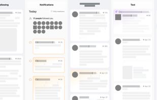
- Grouped notifications
- Nested comments thread
- Unsent draft recovery
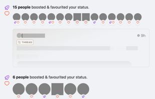
- Boosts Carousel™?
- Shortcuts with view modes like multi-column or tab bar
- Multi-hashtag timeline
Design decisions
- Status actions (reply, boost, favourite, bookmark, etc) are hidden by default.
- They only appear in individual status page. This is to reduce clutter and distraction. It may result in lower engagement, but we're not chasing numbers here.
- Boost is represented with the rocket icon.
- The green double arrow icon (retweet for Twitter) doesn't look right for the term "boost". Green rocket looks weird, so I use purple.
- Short usernames (@username) are displayed in timelines, instead of the full account username (@username@instance).
- Despite the guideline mentioned that "Decentralization must be transparent to the user", I don't think we should shove it to the face every single time. There are also some screen-reader-related accessibility concerns with the full username, though this web app is unfortunately not accessible yet.
- No autoplay for video/GIF/whatever in timeline.
- The timeline is already a huge mess with lots of people, brands, news and media trying to grab your attention. Let's not make it worse. (Current exception now would be animated emojis.)
- Hash-based URLs.
- This web app is not meant to be a full-fledged replacement to Mastodon's existing front-end. There's no SEO, database, serverless or any long-running servers. I could be wrong one day.


Comments and Reviews
Minimalistic in the sense that it's not cluttered, opinionated in the sense that it has a strong design philosophy. Optimized for mobile and runs well on desktops too.
Single-column view like the regular Mastodon web view, but easier on the eyes and more comfortable to use. Buttons are hidden in the timeline to encourage you to think about what you're doing before you boost, like, or reply.
Nice features like "Catch-up," which shows you a sortable list of posts within the last hour (adjustable up to 12 hours) and doesn't scroll infinitely, so you can feel like you're done. The "boost carousel" pulls boosts out of the main timeline to cut down on clutter and emphasize people's actual posts. This one works better on mobile.
More solid than Elk, especially when using GoToSocial or another server that accepts Markdown.
Easily my favorite Mastodon client. It looks very clean, and the features like catch-up or switching between instance previews on a whim make browsing the Fediverse more enjoyable. I ♥ Phanpy!