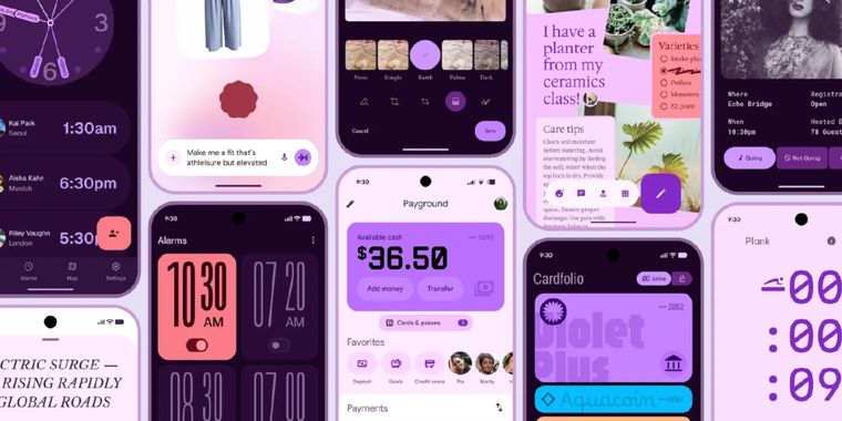
Google accidentally leaked its next major design language, Material 3 Expressive
Google’s next major Android redesign, Material 3 Expressive, was inadvertently leaked through a now-deleted official blog post. The post, identified by 9to5Google and still available via the Wayback Machine, details what Google calls its “most researched” Android update to date. Over 46 rounds of user interface design and testing, involving more than 18,000 participants, shaped this new approach.
Material 3 Expressive revolves around the expressive use of color, shape, size, and motion, aiming to make the Android interface more visually appealing and easier to navigate. Practical benefits are already emerging from Google’s tests: according to the leaked information, users were able to locate key UI elements up to four times faster compared to previous Material 3 designs. The new system’s research analyzed real user attention patterns and reactions to different visual styles, as well as their intuition when interacting with revised layouts.
Google also tested how changes to progress indicators and button sizing could impact both tap speed and clarity—seeking a balance that improves both perceived and functional usability. Material 3 Expressive is set to receive a dedicated session at Google I/O later this month, hinting at an official unveiling soon.


Comments
Wow... A new design revolution for dev is coming...
Rather, "Expressionist". I would fit in Der Kabinet von Doktor Caligari.
hopefully the setting menu doesnt become pop art in the future
It's more rounded, bigger padding, large weird fonts, small generic icons, and pale colors, or as Google put it: "expressive", "cool", "brand feel fresh", "forward-thinking", "rebellious" and better "subculture perception". I'm just missing "vibe", "chill" and "shook" from my bingo card, then I'll go to bed, because yes, I may have already became this grumpy old boomer that gave up on this Z generation.