


The 960 Grid System is an effort to streamline web development workflow by providing commonly used dimensions, based on a width of 960 pixels. There are two variants: 12 and 16 columns, which can be used separately or in tandem.


Sites and apps similar to YAML CSS Framework include Bootstrap, which is free and open source. Other options are Tailwind CSS, Foundation, Material UI and Materialize. CSS Frameworks like YAML CSS Framework are a crowded field, with more than 25 alternatives for self-hosting, Mac, Windows, Linux and Android.
The 960 Grid System is an effort to streamline web development workflow by providing commonly used dimensions, based on a width of 960 pixels. There are two variants: 12 and 16 columns, which can be used separately or in tandem.

Phonon is a front-end framework made with mobile and desktop in mind. It offers clear and neutral components that integrate best practices and ideas coming from well-known design styles.

Set column and gutter widths, choose the number of columns, and switch between pixels and percentages.

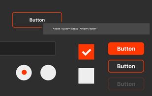
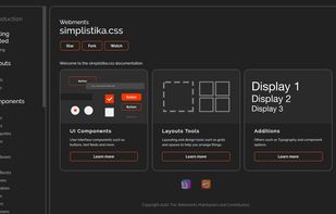
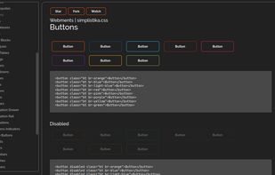
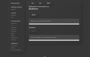
Webments is a collection of libre frameworks designed with scratch CSS using different design languages.


inuit.css is a lightweight, constantly updated CSS framework which provides you with a pragmatic and feature-rich starting point for all your projects.


960 grid system with 12 columns for Responsive Web Design. PSD file which has the 960 grid setup for you based on 32px gutters/margins.

The Fluid Baseline Grid System is an HTML5 & CSS3 development kit that provides a solid foundation to quickly design websites with ease.
The Fluid 960 Grid System templates have been built upon the work of Nathan Smith and his 960 Grid System using effects from the MooTools and jQuery JavaScript libraries. The idea for building these templates was inspired by Andy Clarke, author of Transcending CSS, who advocates...


 Cyprus
 EU


 Israel


 United Kingdom


 Finland