


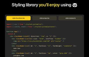
CSS-in-JS with build time generated styles, RSC compatible, multi-variant support, and best-in-class developer experience.
Cost / License
- Free
- Open Source (MIT)
Application type
Platforms
- Self-Hosted


Sites and apps similar to Little Widgets include Bootstrap, which is free and open source. Other options are Tailwind CSS, Bulma, Semantic UI and Foundation. CSS Frameworks like Little Widgets are a crowded field, with more than 50 alternatives for self-hosting, Mac, Windows, Linux and Android.
CSS-in-JS with build time generated styles, RSC compatible, multi-variant support, and best-in-class developer experience.

Skeleton is a small collection of CSS & JS files that can help you rapidly develop sites that look beautiful at any size, be it a 17" laptop screen or an iPhone. Skeleton is built on three core principles:


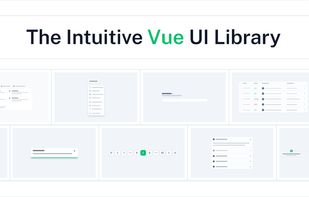
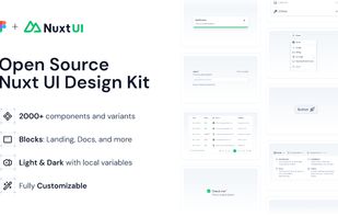
Create beautiful, responsive & accessible web apps quickly with Vue or Nuxt. Nuxt UI is an open-source UI library of 100+ customizable components built with Tailwind CSS and Reka UI.

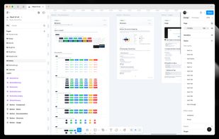


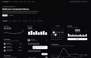
A set of beautifully-designed, accessible components and a code distribution platform. Works with your favorite frameworks. Open source. Open code.


A unified, HTML5-based user interface system for all popular mobile device platforms, built on the rock-solid jQuery and jQuery UI foundation. Its lightweight code is built with progressive enhancement, and has a flexible, easily themeable design.
 United States


Front-end framework with a built-in dark mode and full customizability using CSS variables; great for building dashboards and tools.


Topcoat is a brand new open source CSS library designed to help developers build web apps with an emphasis on speed. It evolved from the Adobe design language developed for Brackets, Edge Reflow, and feedback from the PhoneGap app developer community.


Eva Design System is a free and open-source, customizable design system. Available for Sketch with Mobile and Web component libraries.
United States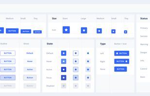


Spectre.css is a lightweight, responsive and modern CSS framework for faster and extensible development.


This project's goal is to be able to create a fully accessible material design styled website using React Components and Sass.
 Denmark
 EU
EU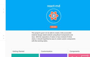


Simple. Robust. Responsive. Flexible.
Based on Flexbox (CSS Flexible Box Layout Module), Gridlex is a very simple css grid system to quickly create modern layouts and submodules.
 FranceEU


 Russia


