Simple. Robust. Responsive. Flexible.
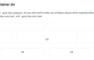
Based on Flexbox (CSS Flexible Box Layout Module), Gridlex is a very simple css grid system to quickly create modern layouts and submodules.
Eva Design System is described as 'Free and open-source, customizable design system. Available for Sketch with Mobile and Web component libraries' and is an app in the development category. There are more than 50 alternatives to Eva Design System for a variety of platforms, including Web-based, Self-Hosted, Mac, Windows and Linux apps. The best Eva Design System alternative is Bootstrap, which is both free and Open Source. Other great apps like Eva Design System are Tailwind CSS, Bulma, Semantic UI and Foundation.
Simple. Robust. Responsive. Flexible.
Based on Flexbox (CSS Flexible Box Layout Module), Gridlex is a very simple css grid system to quickly create modern layouts and submodules.

Mobile Angular UI is a mobile UI framework just like Sencha Touch or jQuery Mobile. If you know Angular JS and Twitter Bootstrap you already know it!

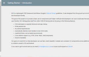
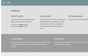
Flat UI Pro is made on the basis of Twitter Bootstrap in a stunning flat-style, and the kit also includes a PSD version for designers. Flat UI Pro contains a huge number of basic components, icons and glyphs.
GroundworkCSS is a 100% free and open source responsive HTML5, CSS and JavaScript Framework.
HTML KickStart is a ultra–lean set of HTML5, CSS, and jQuery (javascript) files, layouts, and elements designed to give you a headstart and save you a lot of hours on your next web project.
Responsable is a responsive HTML CSS LESS SCSS framework with clean markup, normalized CSS, and responsive images. It allows for nested columns for easy grid nesting and customization, and provides base styles for forms, tables, and typography for faster startup on your projects.
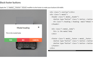
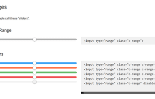
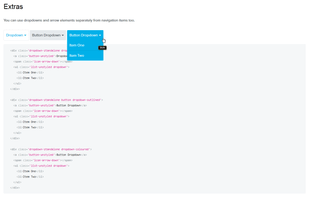
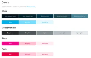
yeti.css is a pattern library consisting of lightweight, reusable modules. It has been built to reflect &yet's visual and branding guidelines.
The Goldilocks Approach to Responsive Web Design - A good starting point for design that takes device resolution out of the equation.