





BubbleMarkets
Like
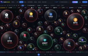
BubbleMarkets shows stocks, ETFs, crypto, forex, commodities, bonds and indices as live bubbles sized by market cap and coloured by price move. Free, no account needed.

Cost / License
- Freemium (Subscription)
- Proprietary
Platforms
- Online


Features
BubbleMarkets News & Activities
Highlights All activities
Recent activities
 sizmit added BubbleMarkets as alternative to QuantiBot.ai
- SabinEwing added BubbleMarkets
 SabinEwing added BubbleMarkets as alternative to FinViz and TradingView


BubbleMarkets information
Developed by
 BubbleMarkets
 Licensing
Proprietary and Freemium product.Pricing
Subscription ranging between $20 and $99 per month + free version with limited functionality.Alternatives
3 alternatives listedBadge
Get an embeddable badge for BubbleMarketsSupported Languages

No comments or reviews, maybe you want to be first?