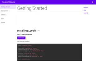
Unpack your meal and get coding. An invasive CSS library to get your style started.
- CSS Framework
- Free • Open Source
- Self-Hosted
- CSS
Best alternatives are  Bootstrapand
 Tailwind CSS
75 alternativesBootstrapandTailwind CSS
Unpack your meal and get coding. An invasive CSS library to get your style started.
BootstrapandTailwind CSS
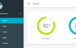
Google's front-end web framework for building sites to the Material Design specification.
 BootstrapandTailwind CSS
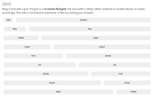
The 960 Grid System is an effort to streamline web development workflow by providing commonly used dimensions, based on a width of 960 pixels. There are two variants: 12 and 16 columns, which can be used separately or in tandem.
BootstrapandTailwind CSS
Juiced has many of the same layout features that you know and love, but improves upon them with better mobile targeting, custom column ordering, better alignment options, understandable HTML, and less boilerplate styles.
BootstrapandTailwind CSSBootstrapandTailwind CSS
Milligram provides a minimal setup of styles for a fast and clean starting point. Specially designed for better performance and higher productivity with fewer properties to reset resulting in cleaner code.
Tailwind CSSBootstrapandTailwind CSS
Webments is a collection of libre frameworks designed with scratch CSS using different design languages.
 BootstrapandTailwind CSS
A lightweight responsive Stylus/CSS framework based on flexible box.
 BootstrapandTailwind CSS
inuit.css is a lightweight, constantly updated CSS framework which provides you with a pragmatic and feature-rich starting point for all your projects.
BootstrapandTailwind CSSThe Fluid 960 Grid System templates have been built upon the work of Nathan Smith and his 960 Grid System using effects from the MooTools and jQuery JavaScript libraries. The idea for building these templates was inspired by Andy Clarke, author of Transcending CSS, who advocates...
BootstrapandTailwind CSSFoldy960 - A responsive version of the 960 grid, the Pvel way!.
BootstrapandTailwind CSSUnsemantic is a fluid grid system that is the successor to the 960 Grid System. It works in a similar way, but instead of being a set number of columns, it's entirely based on percentages.
BootstrapandTailwind CSS
The world's smallest responsive CSS framework* (398 bytes gzipped and minified)
Tailwind CSS
Wing is a minimal CSS framework that provides a base of styles, and you don't even need to learn a gazillion class names, all of your elements will be styled automatically. Wing is only 4kb minified.
 BootstrapandTailwind CSS
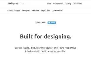
Create fast loading, highly readable, and 100% responsive interfaces with as little css as possible.

Frow is an HTML and CSS framework for creating quick, responsive, mobile-first projects on the web.
BootstrapandTailwind CSS
Build your website interface using a responsive CSS framework with various components and with integrated dynamic functionalities.
Free for non-commercial purposes.
 BootstrapandTailwind CSS
 BootstrapandTailwind CSS
Free framework with 400+ UI elements, 600+ icons, CSS animations, SASS files, responsive layouts, various templates, tutorials, and support for multiple JS frameworks.
 BootstrapandTailwind CSS
Eternium is a simple, no-JavaScript, compilation-free, responsive CSS library for layout and styling elements, requiring less markup and classes than other libraries.
 BootstrapandTailwind CSS
Carefully crafted, easy to customize, fully responsive UI Components, Templates and Tools for your Tailwind CSS based projects.
 BootstrapandTailwind CSS
Lite CSS is a simple but also unique web framework. The term 'Lite' expresses the simplicity but also how light the project is!
BootstrapandTailwind CSS
Yet Another Multicolumn Layout (YAML) is a modular CSS framework for truly flexible, accessible and responsive websites.
BootstrapandTailwind CSS
BareCSS is a CSS only framework that styles frequently used HTML tags without the need for classes. It also provides a few utilities such as a responsive grid and CSS only tooltips.
 Eva Design System


