


Fluid 960 Grid System Alternatives
Fluid 960 Grid System is described as 'The Fluid 960 Grid System templates have been built upon the work of Nathan Smith and his 960 Grid System using effects from the MooTools and jQuery JavaScript libraries. The idea for building these templates was inspired by Andy Clarke, author of Transcending CSS, who advocates' and is a CSS Framework in the development category. There are more than 50 alternatives to Fluid 960 Grid System for a variety of platforms, including Web-based, Self-Hosted, Mac, Windows and Linux apps. The best Fluid 960 Grid System alternative is Bootstrap, which is both free and Open Source. Other great apps like Fluid 960 Grid System are Tailwind CSS, Semantic UI, Foundation and Material UI.
Alternatives list
A grid system for responsive web design. Includes folding columns, elastic gutters, a zoomable baseline grid, and a delightful grid overlay script.
Cost / License
- Free
- Open Source
Platforms
- Online

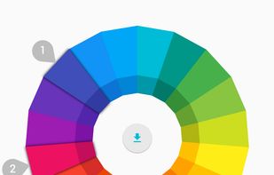
Google's front-end web framework for building sites to the Material Design specification.

 F
F
The 960 Grid System is an effort to streamline web development workflow by providing commonly used dimensions, based on a width of 960 pixels. There are two variants: 12 and 16 columns, which can be used separately or in tandem.
 F
F
Less Framework is a CSS grid system for designing adaptive websites. It contains 4 layouts and 3 sets of typography presets, all based on a single grid.
 F
F
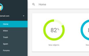
Phonon is a front-end framework made with mobile and desktop in mind. It offers clear and neutral components that integrate best practices and ideas coming from well-known design styles.
Cost / License
- Free
- Open Source
Application type
Platforms
- Mac
- Windows
- Linux
- Online
- Android
- iPhone
- Android Tablet
- iPad
 F
F
Set column and gutter widths, choose the number of columns, and switch between pixels and percentages.
Cost / License
- Free
- Open Source
Platforms
- Online
 F
FCost / License
- Free
- Open Source
Platforms
- Mac
- Windows
- Linux
- Online
- Android
- iPhone

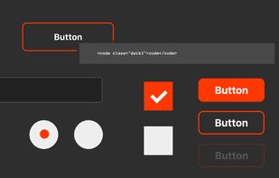
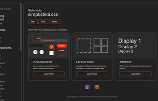
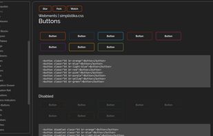
Webments is a collection of libre frameworks designed with scratch CSS using different design languages.
Cost / License
- Free
- Open Source
Application types
Platforms
- Online
- Self-Hosted
 +1
+1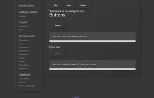
 F
F
Wee is an extensible front-end web development framework for building responsive websites using Less CSS paired with a powerful JavaScript library.
 F
F
 Spain
Spain EU
EU Finland

 United States


 Cyprus
 Israel


