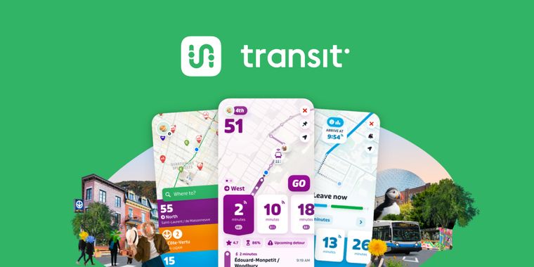
Transit 6.0 launches with new typeface, refreshed design, Neon dark mode and new ETA cards
Transit, the navigation app for Android and iOS, has launched its 6.0 update, introducing a series of visual and functional changes for city commuters. Leading the changes, Transit replaces its longtime Interstate typeface with a custom version of Puffin. This font provides a friendlier and more modern look, shifting away from a style associated with North American car culture.
Building on the visual update, the app now features a redesign with improved search and schedules screens, larger font sizes, and increased use of white space. Trip details and route screens have also been completely overhauled for better clarity and navigation. Alongside these design changes, Transit 6.0 places estimated time of arrival (ETA) cards at the center of the user experience. ETA information is accessible not only from the home screen but persists throughout route exploration, allowing users to access all route details in one place.
Additionally, a newly designed Neon dark mode introduces more vivid colors and higher contrast, enhancing readability in low-light environments. Beyond these primary updates, the app aims to deliver a more refreshing feeling each time it is launched, reflecting a renewed focus on user comfort and daily experience.


Comments
Moovit, or even Google Maps, are way better, at least in my city
Nice app, for sure, but this new "Material Design 3" based, the one that Google said it has "rebelliousness", may look too vivid (especially the dark theme) and too big for older generations that used to find transit times from printed timetables very fine. Now, most of the Transit data comes from public open sources (like realtime GTFS feeds for bus and tram), that for example all major EU cities must produce and keep up to date, so it's pretty reliable.
Never used that app but from these screenshots the new redesign looks sick! I hope it doesn't put accessiblility aside though.